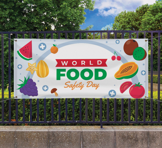
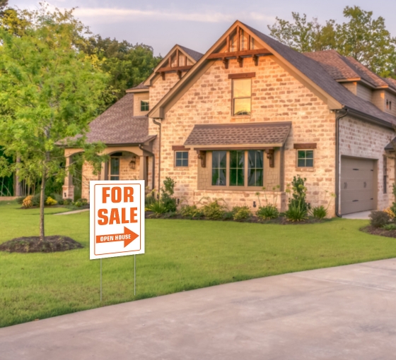
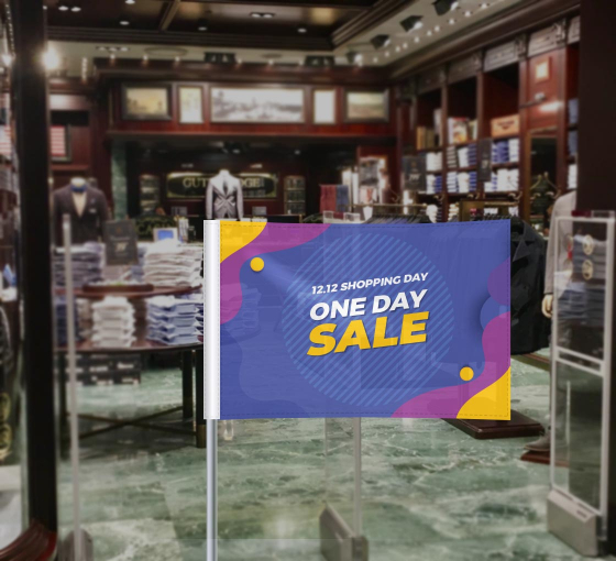
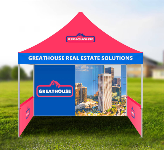
Banners are one of the most profitable investments to advertise your brand or product in a sophisticated fashion. However, to stand apart from the competition, you must ensure that your event banners are visually appealing and can be easily spotted by your target audience.
Event banners differ slightly from other banner types since these banners only convey information about a particular event and not the overall products or services you provide. Consider sharing your holiday event message with well-designed event banners that attract a larger audience and boost sales.
Decide How Many Banners to Make
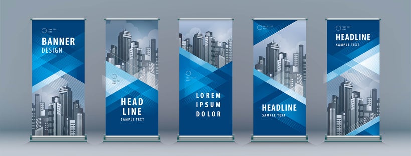
Advertising tools like pop-up displays and event-specific banners are typically made for conferences, trade shows, holiday greetings, sale days, and many other occasions. Once you have a banner ready in your mind,
If the event is off-premise, like a trade show or fair, you will only have an allocated amount of space to decide the size of the banner according to the available dimensions. If the special event is in tiny booths or narrow spaces, a single banner might be adequate. Most businesses typically buy two banners for a small-scale event. Consider getting three or four well-designed event banners for medium-sized spaces. Larger spaces often require even more banners to cloak the entire area in the same visual palette.
Include Key Information
When organizing a special event, you must design and display signage that focuses on the specific goals and benefits of the event being conducted. Event banners have distinct differences from other types of business signage in numerous ways, such as the type of information displayed on the sign.
If you are designing a business event banner, the most crucial detail you must include is your business name and logo since it helps link your company with the special event. Besides that, you must also print information regarding the date and time of the event.
Be sure to add contact information to book tickets and cater to other questions regarding attendance. Typically, you can include a contact number or website redirecting visitors to the event details and pertinent information.
DIY Design Tips
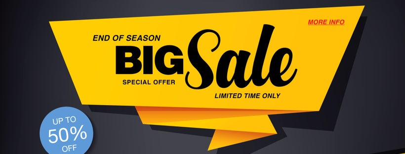
There are many simple Do-It-Yourself tips and methods available for you to design and create your ideal banner. Keep these considerations in mind when you design banners for your next special event:
- Scannable Text: Use large font sizes and ensure that it is easily readable. The easiest fonts to read are Georgia, Helvetica, and PT Sans.
- A Theme-Focused Message: Design an event banner that speaks your audience’s language, emphasizes the event’s goal, and customize the design to reflect the event’s theme.
- Add Relevant Graphics and Imagery: Psychology experts claim that humans retain 65% more information when they see a banner ad paired with a related image. Therefore, you must add theme-based graphics and images related to the event and the theme.
- Color Psychology: Brighter hues and vibrant colors in a banner attract more energy and often have higher conversion rates from observers compared to dull-colored banners.
- Pick An Appropriate Background: A solid color helps promote people or products. However, a picture background is ideal for advertising abstract ideas and internet-based services.
- Keep It Short: Since you are creating an event banner, keep your key message to a single sentence or two without being verbose as you wish to attract maximum attention from passersby.
Ways to Elevate Your Banners
After designing and creating your custom banner, there are still ways to enhance it’s advertising abilities:
High-quality Imagery
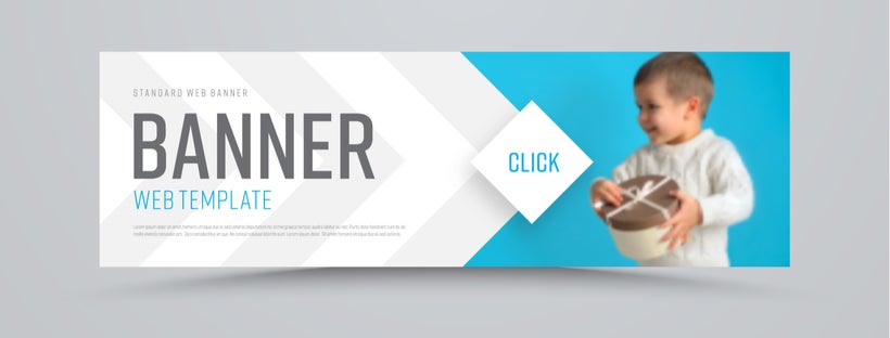
Be it photographs or graphic art, visually-appealing images are a great way of enhancing your banner’s design. To ensure that the image looks sharp despite the change in size, it is important to use the appropriate file type for the picture, coupled with a high-enough resolution, rather than a low-quality image that will look blurry.
A Clear Focal Point
Maintaining a sharp and crisp focal point is crucial if you plan to convey essential information to passersby who glance at your banner.
Your focal point can be a logo, an image, or a line of text. Here are a few methods to help you with this task:
- Use Contrast: Use a bold color on an image or word to ensure that it stands out from other not-so-relevant details on the banner.
- Text Emphasis: Underline, highlight, capitalize, or bolden the text to attract the eyes of passersby immediately. Almost all people instantly recognize that they must read the underlined or highlighted text.
- Elevate Your Banners: You can also make the overly-pronounced section of the banner appear bigger than other elements since large images instantly draw more attention over the smaller ones. Moreover, you can use banner stands to add height and structure to your banners.
Make Banners Interactive
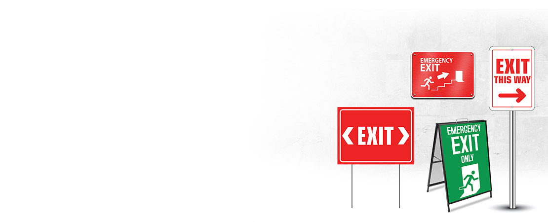
Interactive ads let you analyze the response of the people towards your ad. These banner types are more engaging with many benefits included. Offer directional prompts to assist with wayfinding to prompt guests to take certain actions at your event.
Banners provide powerful communication tactics if they are properly used. You can add velcro elements to your banners or position spinning wheels or other interactive tools next to your banners to drive participation. Have an employee pass out flyers near your special event banners or use banners to direct the audience’s attention to video presentations. All of these solutions are cost effective and produce greater engagement.
Final Words
Banners are a crucial segment of offline marketing since they drive traffic without overspending on marketing and facilitate reusability. Banners are an amusing, colorful, and durable marketing tool whose effectiveness can be amplified by following designing tips.
When purchasing signage, ensure that you only buy from a platform that lets you create custom banners since you can design your banner and have it tailored to your specific requirements.



 Posted in

