


Visibility in low-light conditions is often overlooked, yet it’s crucial for safety, readability, and impact; whether you’re creating event signage, outdoor displays, or everyday directional signs. Color contrast plays a pivotal role in ensuring your designs stand out in dimly lit environments.
Choosing the right colors isn’t just about aesthetics; it’s about function and making sure your message reaches the audience effectively. Here’s how you can master visibility-focused color design and use contrasts to create impactful designs for low-light environments.
Why Color Contrast Matters in Low-Light Conditions
In low-light environments, the human eye struggles to distinguish details and colors. This is where contrast steps in as a critical factor for enhancing visibility. High contrast between text, images, and backgrounds ensures that key elements of your design remain clear and legible.
For instance, if you’re using a trade show banner or a large outdoor sign for a nighttime event, a well-thought-out color contrast ensures your message doesn’t fade into the shadows.
Best Practices for Enhancing Visibility with Color Contrast
1. Choose Opposing Colors
Colors on opposite ends of the color wheel provide the strongest contrast. For example:
- Black and white: A classic combination that’s both professional and attention-grabbing.
- Blue and yellow: A vibrant contrast ideal for highlighting key text.
- Red and green: Great for adding an energetic and bold touch, though sparingly used for readability.
For low-light environments, darker backgrounds with lighter text often work best. If you’re using a custom sign, try pairing a navy background with white or light yellow text for optimal clarity.
2. Use Bold, Saturated Colors
Subtle shades tend to get lost in low-light conditions. Opt for bold, saturated colors that stand out even under minimal lighting.
Example: A pop-up banner display for an evening trade show might use rich reds or blues for the background and bright whites or yellows for the text. The vibrancy ensures your message is visible from afar.
3. Keep It Simple
Complex color schemes can confuse the eye, especially in dim lighting. Stick to 2-3 contrasting colors to maintain clarity and focus.
- Primary Action: Use one color for the background, one for the text, and one for highlights or accent details.
- Pro Tip: If you’re designing event signage ideas for outdoor gatherings, consider high-contrast combinations like deep black with bright yellow, which are universally legible.
Contrast Tips for Low-Light Environments
1. Text vs. Background Contrast
Ensure there’s a clear distinction between text and background. High-contrast color schemes like white text on black or dark text on yellow backgrounds are ideal for low-light settings.
2. Emphasize Key Elements
Use contrasting accent colors to highlight crucial elements like directional arrows or keywords. For example, a trade show booth display can use a bold red arrow to point toward your product table, drawing attention immediately.
3. Avoid Overuse of Bright Colors
While bright colors enhance visibility, overusing them can strain the eyes, especially in dim settings. Balance bright accents with neutral tones for a professional look.
Products Designed with Contrast in Mind
When designing displays or signage, using professional materials and templates can enhance your results. For instance:
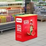
- Banner Stands: Perfect for both indoor and outdoor events, banner stands allow you to experiment with bold color contrasts to ensure readability in varying light conditions.
- Window Signs: Ideal for storefronts, contrasting colors make these signs effective at grabbing attention, even at night.
- Event Backdrops: Large, customizable backdrops with high-contrast graphics make your booth stand out in low-light environments like nighttime events or dimly lit trade shows.

How to Choose Colors for Low-Light Environments
1. Consider the Environment
- For outdoor nighttime use: Opt for reflective or light-colored designs to ensure visibility.
- For indoor low-light areas: Go for warm contrasts like dark navy and gold, which create a balanced yet bold look.
2. Use Reflective Elements
Incorporating reflective materials enhances visibility in extremely dim conditions. Reflective accents can make directional event signs or safety instructions pop.
3. Test in Real Conditions
Always test your design in the intended environment. A design that looks great in daylight might fall flat in dim lighting. Place your trade show banner or signage in a low-light setup to identify and fix visibility issues before the event.
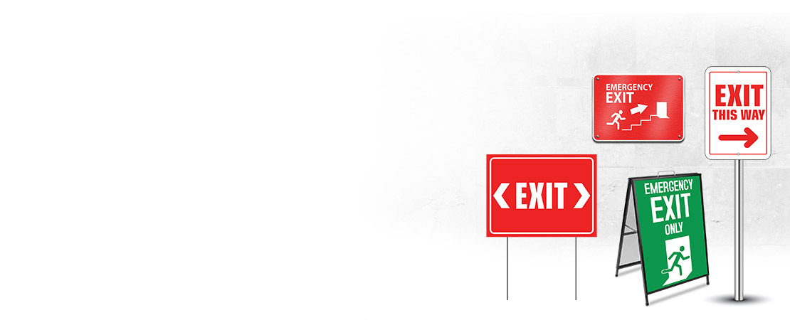
Examples of Effective Contrast for Low-Light Displays

FAQs: Mastering Color Contrast for Low-Light Visibility
Q1. Why is color contrast so important in low-light environments?
A1. In dim settings, the human eye struggles to differentiate similar colors. High contrast ensures text and visuals remain legible and clear.
Q2. What’s the best color combination for event signage?
A2. It depends on your brand, but black with bright yellow or navy with white are reliable choices for ensuring visibility in low light.
Q3. Are reflective materials necessary for outdoor signs?
A3. They’re not essential, but reflective accents significantly enhance visibility at night, especially for directional signs or banners.
Q4. Can I use more than three colors?
A4. It’s possible, but stick to 2-3 contrasting colors for the core design. Extra colors should be subtle and used sparingly as accents.
Q5. How can I make text more readable on banners?
A5. Use bold, sans-serif fonts in contrasting colors. Avoid intricate fonts that may blur in low light.
Writer’s Note:
When it comes to color contrast visibility, the choices you make can make or break your design’s impact. Whether it’s a trade show banner, window sign, or outdoor display, ensuring your design stands out in low-light conditions is a must for effectiveness and professionalism.
Remember to test your designs, keep color schemes simple, and don’t shy away from bold contrasts. With the right approach, your signage can shine—even in the dimmest settings.
Written By BestofSigns Editorial Team.
 Posted in