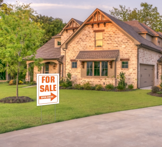
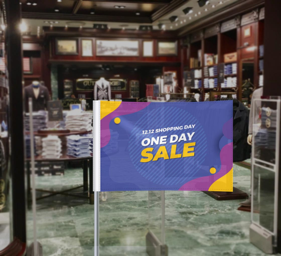
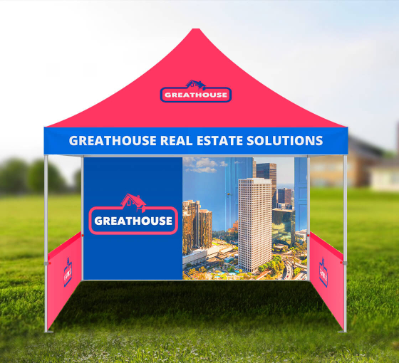
Special event banners require extra attention and are slightly different from regular advertising banners. They require a lot of creative details like topical imagery, messaging specific to your special events, and prevalent information about your sales and business. So, here are some points to keep in mind while creating special event banners:
Designing is in the Details
Special event banners are one of the best marketing tools available. They can be customized using designs to generate buzz based on culturally relevant days. They are extremely durable and usually made with high-quality materials, if you purchased them from the right store. Custom vinyl banners can withstand various weather conditions and won’t fade or smudge, when it rains or snows. They also look extremely vibrant and will last a long time if stored properly.
- Authentic
The banner you create should be authentic to the specific event. Decide on the theme of the event and create your banners in a creative way so your audience will associate them your brand and business. The theme should be audience-appropriate while still being within your budget. It should also incorporate the event you are trying to celebrate.
- Aesthetically Pleasing
Make your banner designs eye-catching and on-brand. The banner design needs to be attractive and based on your potential audience. This means that you have to pay special attention to every little detail when designing your banners. Consider hierarchy in your design to ensure the colors, the font, images, logos, and information all have a place on your banner.
- Images & Information
You should avoid overcrowding your banner, in many cases simple designs are a more successful approach. Too much information can drive away your audience, so avoid placing too many conflicting ideas or images and opt for honing in on the main message of the banner. Also, make sure to properly space out your text. It should look visually appealing and be legible. A banner that is text-heavy may not grab the attention of an audience that is constantly on the move.
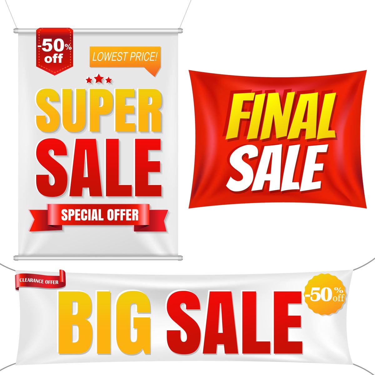
How to Design Event Banners
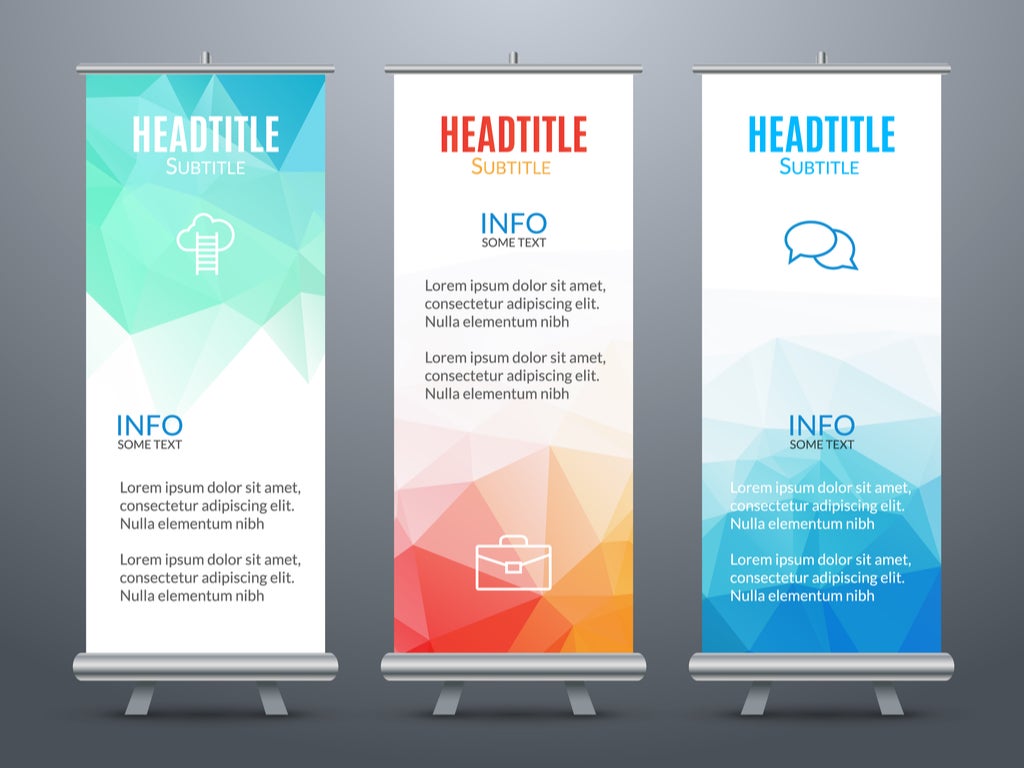
Advertising like Banner stands, vinyl banners, and even digitally-focused adverting methods (i.e., social media banners, online banner ads)– all are great options for promoting your upcoming event. No matter what type of banner you’re currently working on, these tips will help you create something attractive and impactful:
Make It Large
Make sure the text on the banner is large and easy to read. You should also take the font you are using into consideration. The easiest fonts to read include Helvetica, Georgia, and PT Sans.
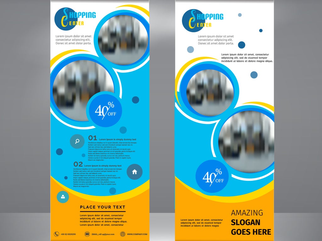
Consistent Message
Ensure that you don’t put multiple messages on your special events banner. Keep your message focused on the event you are hosting, by being direct your message will be pointed and easy to understand. Successful event banner copy speaks your audience’s language, has one main goal, and concludes with a simple call to action.
Add Relevant Visuals
According to research, humans retain 65% more information from an ad when it’s paired with a specific and related image as opposed to the 10% retention rate for messages without images or images that are too general. So, it is not only important to use images but to use relevant images for your event banner. The goal is to avoid generic stock images, and to select specific images relevant to your event instead.
Let There Be Light
According to color psychology, brghter hues lead to more energy (and therefore action) from observers. Hence a brightly colored banner is preferred over darker hues.
Pick a Smart Backdrop
A solid color is great to promote products or people. While you should pick a photo background for abstract ideas and internet-based services.
Minimal Content
Remember that less is more not only in banners, but as a good rule of thumb for other forms of advertising as well. Keep your main message to a single sentence or two and limit additional lines to a handful of words. Ensure that your text does not exceed more than five lines.
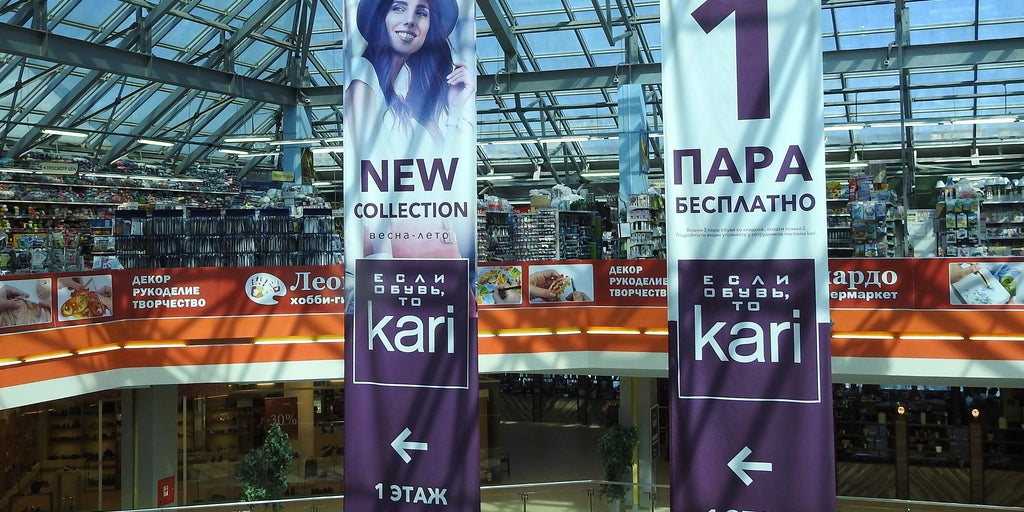
Balance Your Layout
Regardless of the type of banner you are making, you should prioritize spacing and placement for the following:
- Company logo
- The main message (one or two lines)
- One or two relevant images
- CTA (Call To Action)
A well-balanced layout attracts more customers and helps your store stand out.
Final Thoughts –
Event banners are a great choice for stores that want to market their business while connecting with their audience. Custom Banners are affordable, easily stored, portable, and lightweight. They will boost up your publicity and help you drive profits for your business.



 Posted in